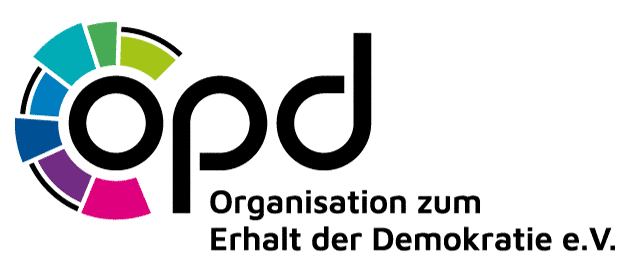
opd expresses an international idea
The letters refer to “Organization for the preservation of democracy”. The English name is intended to make the idea understandable beyond Germany. The logo and corporate design were created by Katinka Bartels.
A colourful parliament
The coloured shapes around the “o” can be read as the seats of an imagined parliament. The “o” then represents the people at its centre: the electorate. The colours are fictional and do not depict particular parties or a real distribution of seats.
The interrupted outer line invites reflection on boundaries, rules and crossing them. It is a design element, not a depiction of a particular parliamentary event.
The voices of members
A second reading sees the coloured shapes as different answers to a survey. The “o” represents their shared foundation: the people taking part. Both interpretations fit the idea of making members’ voices visible.
How do you read the symbol?
We welcome your interpretation and feedback through Contact. Please contact opd before using the logo elsewhere. See the notice on use.